

Branding Is Bigger Than a $20 Logo

Several years ago, I saw someone in a Facebook group ask for help with branding, including a logo. Designers started sharing their experience and examples. Then somebody jumped into the comments with a much cheaper solution:
“Why not buy a $20 logo on Etsy?”
That suggestion irritated me at the time because it treated a logo template and a full branding process as if they were the same product.
They are not.
That does not mean every premade logo is bad or that a new business must spend thousands of dollars before earning its first dollar. It means you need to understand what you are buying, what you are not buying, and whether the option fits the stage and goals of the business.
A $20 logo may give you a visual starting point. It cannot decide how your business should be positioned, what you want to be known for, why the right client should care, or how the brand should feel across every interaction.
That is the work of branding.
Your Brand and Logo Are Not the Same Thing
Your logo is an identifier. It helps people recognize the business.
Your brand is the larger impression people form through what you say, how you look, what you deliver, and what it feels like to work with you.
Branding is the intentional work of shaping that impression.
It includes several connected pieces:
Brand strategy
This covers the foundation of the business, including:
- Who you serve
- What problem you solve
- How you are positioned
- What makes your approach different
- What you want to be known for
- What promise the brand consistently makes
Brand messaging
Messaging turns the strategy into language people can understand. It includes:
- Your core message
- Brand voice
- Service descriptions
- Website copy
- Calls to action
- The phrases and ideas you repeat consistently
Visual identity
This is the visual system people usually mean when they say “branding.” It can include:
- Logo and logo variations
- Typography
- Color palette
- Photography and image direction
- Icons and graphic elements
- Layout and design rules
Brand experience
The experience is where the strategy, message, and visuals meet real life. It includes:
- Your website
- Social media content
- Inquiry and onboarding process
- Proposals and client documents
- Communication
- Service delivery
- Follow-up and offboarding
A gorgeous logo cannot repair confusing messaging, inconsistent communication, or a sloppy client experience. It is one piece of the system.
What a $20 Logo Can Do
A premade or lightly customized logo can be a reasonable short-term option when:
- You are testing a business idea.
- Your budget is genuinely limited.
- You need something simple to begin using.
- You understand that the design may not be exclusive.
- You are willing to replace or refine it as the business grows.
It can help you stop using five random fonts and a different color on every platform. That is useful.
The problem begins when a basic template is sold or treated as a complete brand strategy.
Price does not automatically determine quality. An expensive design can still be wrong, and an affordable wordmark can serve a new business perfectly well. Judge the option by what is included, the rights you receive, and the problem it is meant to solve.
What a Premade Logo Usually Does Not Do
The details vary by seller and listing, but a low-cost premade logo may not include:
- Brand positioning or audience research
- Strategic messaging
- A fully original or exclusive design
- Multiple logo variations
- A usable font and color system
- Accessibility testing
- Files for print and web
- Ownership of every design element
- Trademark research or legal clearance
- Guidance for applying the identity consistently
Read the listing instead of assuming. Ask questions before purchasing. “Customizable” does not always mean “custom,” and “commercial use” does not automatically mean you own every element or can register it as a trademark.
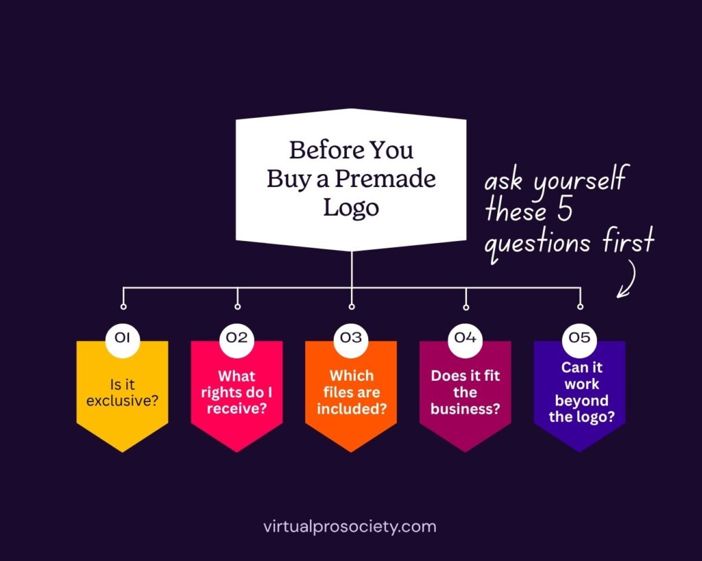
Five Questions to Ask Before Buying a Premade Logo
1. Is the Design Exclusive?
Some premade logos are sold once. Others can be purchased and customized by many businesses.
If the same symbol, layout, or template can be resold, another business may have a logo that looks remarkably similar. That may be acceptable for a temporary starter identity. It is a bigger concern when long-term recognition and legal protection matter.
Ask:
- Is this design sold once or multiple times?
- Which elements will be changed?
- Are the icons or graphics original?
- Are any parts sourced from stock libraries or templates?
Do not assume “personalized with your name” means the underlying design is exclusive.
2. What Rights and Licenses Are Included?
The logo may contain fonts, icons, illustrations, or other assets with separate licenses. You need to know whether those licenses permit your intended commercial use and whether the design can be registered as a trademark.
The rules can differ dramatically from one source to another. A font license may allow use in a logo but restrict trademark registration. A stock graphic may be allowed in marketing materials but prohibited as the central part of a trademark.
Etsy is a marketplace, not the creator of each logo. Its current terms explain that products are made and sold by independent sellers and that Etsy does not inspect or guarantee the authenticity or legality of every item. The individual listing, seller, source assets, and license terms matter.
Ask the seller:
- What exactly am I allowed to do with the final logo?
- Can it be used commercially?
- Can it be registered as a trademark?
- Are all fonts and assets properly licensed?
- Do I need to purchase any separate licenses?
- Will I receive written license or ownership information?
Keep the answers, receipts, and license documents with the brand files.
3. What Files and Variations Will You Receive?
One transparent PNG is not a complete logo package.
At minimum, understand whether you will receive:
- A vector file such as SVG, EPS, or AI
- High-resolution PNG files with transparent backgrounds
- JPG files when needed
- Full-color, black, and white versions
- Horizontal and stacked layouts
- A simplified icon or monogram
- Color values
- Font names and license information
Vector files matter because they can be enlarged without becoming blurry. Logo variations matter because one long horizontal logo will not fit every website header, social profile, document, and small mobile space.
If you are not sure which files you need, ask before purchasing. Rebuilding the logo later because you only received a tiny JPG is not a bargain.
4. Does the Design Fit the Business?
A beautiful logo can still send the wrong message.
Consider the audience, industry, offer, price point, personality, and position of the business. A delicate handwritten logo may look lovely but feel completely wrong for a direct, systems-focused consultant. A heavy corporate design could make a warm, creative service feel distant.
Before choosing a design, write down:
- Three words the brand should communicate
- Three words it should not communicate
- Who the business wants to attract
- What those people need to understand quickly
- Where the logo will be used most often
Evaluate the logo against those answers, not against whether it looks cute in the listing mockup.
5. Can the Identity Work Beyond the Logo?
The design needs to function as part of a larger visual system.
Can you use the fonts for website headings and social graphics? Are they readable? Does the color palette have enough contrast? Is there a clean supporting font for paragraphs? Does the style work with the photography and templates you will use regularly?
Consistency does not mean placing the logo on every inch of the internet. It means the pieces feel related even when the logo is not present.
A useful visual identity should make everyday design decisions easier. If the logo introduces three ornate fonts, six colors, and a style you cannot recreate, it may create more problems than it solves.
The Trademark Question Matters
A seller cannot guarantee that a logo or business name will be accepted as a trademark simply because the design is original to their shop.
The United States Patent and Trademark Office considers several potential reasons for refusal, including whether a mark is likely to be confused with an existing or pending mark. The marks do not have to be identical. Similarity in appearance, sound, or meaning can matter when the goods or services are related. You can review the USPTO’s guidance on possible grounds for refusal for a broader explanation.
A proper clearance search goes beyond looking for the exact business name on Google. If trademark protection matters, consult a qualified trademark attorney before investing heavily in the identity or filing an application.
This is general educational information, not legal advice.
A Better Starter Brand on a Limited Budget
If a full professional branding project is not in the budget yet, build a simple and intentional starter system instead of collecting random design pieces.
Define the foundation
Write down:
- Your audience
- The problem you solve
- Your primary offer
- Three brand traits
- The main message you want people to remember
Keep the visual system simple
Start with:
- A clean wordmark or simple logo
- One personality-forward heading font
- One highly readable supporting font
- Two or three core colors
- Clear rules for photography and graphics
Create the essential variations
Make sure the logo works:
- Horizontally
- In a stacked format
- As a simplified social profile image
- In black
- In white
- At a small mobile size
Use it consistently
Apply the same basic system to the website, social profiles, proposals, invoices, and client materials. Do not redesign the brand every time Canva suggests a new font combination.
This will not replace the strategy and originality of a comprehensive branding project. It gives the business a cleaner foundation while it grows.
Signs You Have Outgrown the Starter Logo
It may be time to invest in a stronger brand identity when:
- The business has changed direction or audience.
- The logo looks similar to competitors.
- You cannot use the design across different formats.
- You do not have the files needed for print or large-scale use.
- The colors or fonts create readability problems.
- The messaging and visuals no longer match.
- You are raising prices or moving into a different market.
- You cannot confirm the rights to important design elements.
- The current identity makes the business look less established than the work actually is.
Rebranding should solve a business problem, not provide an expensive burst of novelty because you became bored with the color palette.
Branding Should Make the Business Clearer
A logo matters. It helps people recognize the business and can set the tone for the visual identity. It just cannot carry the entire brand on its back.
If a $20 premade logo fits the current stage of the business, use it with clear expectations. Check the seller, licensing, files, exclusivity, and trademark limitations before committing. Then build enough strategy, messaging, and consistency around it to make the visual useful.
When the business is ready for a deeper investment, pay for the thinking as well as the design. That is the difference between purchasing a logo and building a brand.
Choose Logo Fonts That Can Do the Job
If typography is your next decision, read 5 Logo Font Rules Worth Following for practical guidance on readability, pairing, testing, and font licensing.
Your logo should identify the business. Your branding should make people understand and remember it.
Choosing logo fonts can get out of hand fast.
You open Canva to compare a few options. Forty-five minutes later, you have 27 favorites, four scripts you cannot read, and no idea which one actually fits the business.
A logo font has a job to do. It needs to reflect the brand, connect with the right audience, remain readable, and work everywhere the logo will appear. Looking cute on a mood board is not enough.
Whether you are choosing fonts for your own Virtual Assistant business or helping a client build a brand, these five rules will help you make a stronger decision without wandering through every font on the internet.
Know What You Are Choosing
Your logo font and your full brand font system are related, but they are not the same thing.
The logo font appears in the primary logo or wordmark. It may also appear in a tagline or short descriptor included with the logo.
Your brand font system covers everything else, including website headings, body copy, social graphics, lead magnets, proposals, and client documents. It usually includes a display or heading font and a highly readable font for longer text.
Your logo can use one font while the broader brand uses two or three. Do not force every font in the brand kit into the logo. That is how a logo starts looking like a group project nobody supervised.
Rule 1: Choose Personality Before Popularity
Fonts communicate before anyone reads the words.
A high-contrast serif can feel polished, editorial, or established. A geometric sans serif may feel modern and direct. A loose handwritten font could feel personal and creative. A heavy condensed font may feel bold, energetic, or industrial.
None of those qualities is automatically better. The right choice depends on the business and the people it wants to reach.
Before browsing fonts, choose three words the brand should communicate. Then choose three words it should not communicate.
For example:
The brand should feel: confident, practical, approachable
The brand should not feel: delicate, formal, corporate
Those six words give you something useful to evaluate. “I like it” is a preference. “This feels too formal for the audience” is a design decision.
Also consider what the audience expects. A playful font might be perfect for a children’s art studio and completely wrong for an estate-planning attorney. The owner’s personality matters, but the brand still needs to make sense to the people buying from it.
Trends can give you ideas. They should not make the final decision. The font currently covering Pinterest may look tired long before the business is ready to rebrand.
Rule 2: Make Readability Non-Negotiable
A logo is not doing its job if people have to squint, guess, or ask what it says.
This becomes especially important with script, handwritten, highly decorative, condensed, and very thin fonts. A beautiful lowercase “r” that looks like an “n” can change an entire business name. That is not the kind of brand recognition anyone ordered.
Test the actual business name, not the sample phrase the font designer used. Font previews are carefully chosen to show off the prettiest letters. Your client’s business name may contain a completely different set.
Look closely at:
- Letters that can be confused, such as I, l, r, n, u, c, and e
- Unusual capital letters
- Tight spaces between letters
- Thin strokes that disappear at small sizes
- Decorative swashes that collide with nearby letters
- Long business names forced into narrow or script fonts
If a display font has plenty of personality but becomes difficult to read in a full name, use it more selectively. It may work for one word, initials, or a short accent while a cleaner font handles the rest.
Accessibility does not mean every brand has to use a plain font. It means personality cannot come at the expense of communication.
Rule 3: Pair Fonts With Contrast
Two fonts work well together when they have different jobs.
One leads. One supports.
Problems start when both fonts demand attention or look so similar that the pairing feels accidental. Two elaborate display fonts usually compete. Two nearly identical sans serifs can look like someone chose the wrong weight by mistake.
Useful pairing formulas include:
Expressive serif plus neutral sans serif
The serif brings personality while the sans serif keeps a tagline or supporting text clean.
Refined serif plus geometric sans serif
This creates a polished look with enough contrast to establish hierarchy.
Try: Playfair Display with Montserrat
Condensed display font plus readable sans serif
The condensed font adds impact while the supporting font keeps smaller words clear.
Try: Bebas Neue with Source Sans 3
Elegant serif plus friendly sans serif
This pairing can feel elevated without becoming stiff or untouchable.
Try: Cormorant Garamond with Nunito Sans
These are starting points, not ready-made brand identities. Adjust the weight, size, capitalization, spacing, and placement before deciding whether the combination works.
You can also build contrast within one font family by using different weights, widths, or styles. A bold wordmark paired with a light or regular tagline from the same family can create a clean, cohesive logo without introducing a second typeface.
Rule 4: Stop at One or Two Fonts
A logo does not need two fonts. It can use one excellent typeface and still have plenty of personality.
Using one font often works well when the business name is the clear focus. You can create hierarchy with size, weight, capitalization, spacing, or color instead of adding another typeface.
A second font makes sense when the logo includes a tagline, location, descriptor, or second word that needs a different level of emphasis.
Three or more fonts inside one logo usually create clutter. Each new typeface adds another voice to the conversation, and eventually everybody is yelling.
Keep the logo itself simple. The larger brand system can do more work across the website, social graphics, and marketing materials.
When you use two fonts, decide which one owns the attention. If both are bold, ornate, oversized, or highly stylized, there is no hierarchy. One of them needs to calm down.
Rule 5: Test It and Check the License
Do not approve a logo font while looking at one large, perfect version on your computer screen.
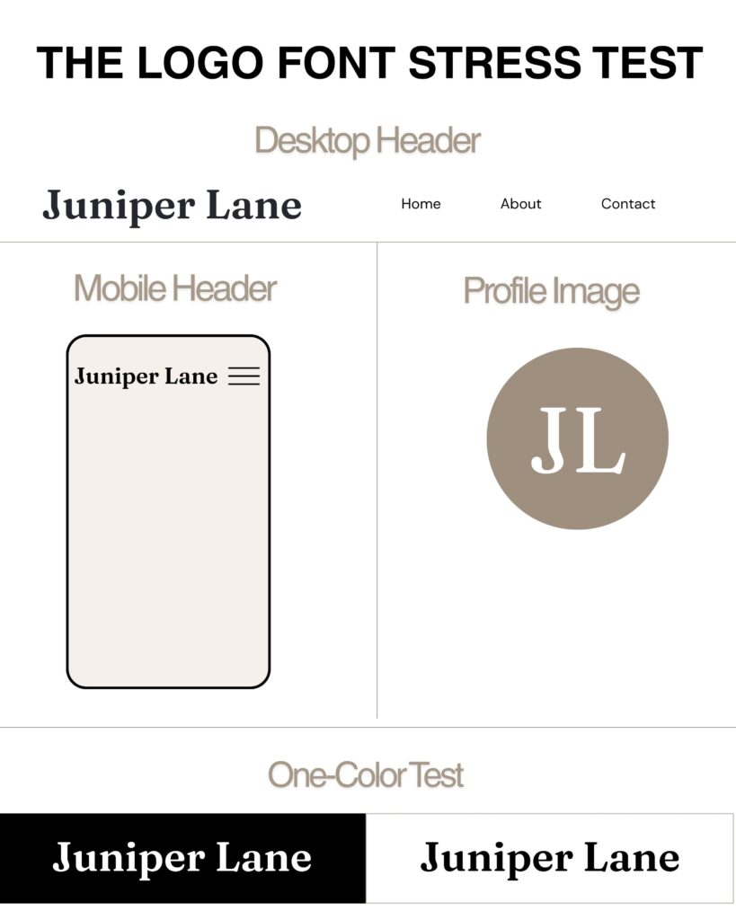
Test the logo in the places it will actually appear:
- At the top of a website on desktop and mobile
- Inside a small social profile image
- On an invoice, proposal, or contract
- As a watermark on a photo
- In black on a white background
- In white on a dark background
- At a very small size
- In a horizontal and stacked logo layout
If the font only works when the logo is enormous, it does not work.
Create a simple one-color version before approving the full logo. Color can make a weak design feel more exciting than it is. When the logo works in solid black, you know the typography and structure can stand on their own.
Then check the font license before delivering anything.
“Free” does not mean “license-free.” Google Fonts explains that every font still has a license, even when it is available at no cost. Open the license information for the specific font and confirm that your intended commercial use is permitted.
Paid marketplaces and subscription libraries have their own rules. Adobe Fonts currently permits commercial logo use and trademark registration, although the typeface design itself cannot be claimed as the trademark. Creative Market currently permits logo use under its Desktop License, but its guidance places a separate restriction on using the licensed font as part of a trademark.
Those terms are different enough to matter. Check the current license from the source instead of assuming every commercial license works the same way.
If you are designing for a client, keep the receipt and license details with the project files. Tell the client whether they need to purchase their own license to install and use the font. Sending them the font file without permission is not a cute little bonus. It can violate the license.
This is general design guidance, not legal advice. When trademark rights or unusual commercial uses are involved, review the exact license or have the client get legal guidance.
Logo Font Mistakes to Avoid
Choosing a font because everyone else uses it
Popularity can make a font feel safe, but it can also make the brand look like every Canva template in the search results.
Using a script for a long business name
Some scripts work beautifully for one short word. Stretching them across four words can turn the logo into a handwriting test.
Ignoring spacing
The default spacing is not always the best spacing. Adjust kerning carefully so letters feel balanced without creating strange gaps or accidental new shapes.
Making every word equally important
The business name, descriptor, and tagline should not all compete at the same size and weight. Decide what someone needs to notice first.
Forgetting the client’s daily tools
If the client needs to recreate graphics in Canva, verify that the supporting brand fonts are available there or can be uploaded under the license. The logo can be supplied as a finished file, but the rest of the brand system still needs to be usable.
Picking website fonts without checking performance
A font that works in a static logo may not be the best choice for live website text. Confirm that a proper webfont license is available and avoid using elaborate display fonts for paragraphs.
A Quick Logo Font Checklist
Before approving the final choice, ask:
- Does the font match the brand’s personality and audience?
- Can I read the business name immediately?
- Does it work at small sizes?
- Does the pairing have clear contrast and hierarchy?
- Does it work in one color?
- Is the license appropriate for logo, commercial, web, and client use?
- Can the client use the supporting fonts in their everyday tools?
- Will this still make sense when the current trend moves on?
If you cannot answer yes to most of those questions, keep testing. Falling in love with the font is optional. Making sure it can do the job is not.
Strong Logo Fonts Do More Than Look Pretty
The best logo fonts feel right for the brand and work in real life.
Start with personality and audience. Protect readability. Use contrast with intention. Keep the number of fonts under control. Test every practical use and confirm the license before delivery.
That process may not feel as exciting as grabbing the first pretty script in Canva, but it produces a logo the business can actually keep.
Build a Stronger VA Business
Inside Virtual Pro Society, Virtual Assistants get practical resources, weekly content support, and straightforward guidance for building a business that works. No giant font party required.
Helping VAs ditch the BS and build systems that actually work.
xoxo, Christi

