

5 Logo Font Rules Worth Following

Choosing logo fonts can get out of hand fast.
You open Canva to compare a few options. Forty-five minutes later, you have 27 favorites, four scripts you cannot read, and no idea which one actually fits the business.
A logo font has a job to do. It needs to reflect the brand, connect with the right audience, remain readable, and work everywhere the logo will appear. Looking cute on a mood board is not enough.
Whether you are choosing fonts for your own Virtual Assistant business or helping a client build a brand, these five rules will help you make a stronger decision without wandering through every font on the internet.
Know What You Are Choosing
Your logo font and your full brand font system are related, but they are not the same thing.
The logo font appears in the primary logo or wordmark. It may also appear in a tagline or short descriptor included with the logo.
Your brand font system covers everything else, including website headings, body copy, social graphics, lead magnets, proposals, and client documents. It usually includes a display or heading font and a highly readable font for longer text.
Your logo can use one font while the broader brand uses two or three. Do not force every font in the brand kit into the logo. That is how a logo starts looking like a group project nobody supervised.
Rule 1: Choose Personality Before Popularity
Fonts communicate before anyone reads the words.
A high-contrast serif can feel polished, editorial, or established. A geometric sans serif may feel modern and direct. A loose handwritten font could feel personal and creative. A heavy condensed font may feel bold, energetic, or industrial.
None of those qualities is automatically better. The right choice depends on the business and the people it wants to reach.
Before browsing fonts, choose three words the brand should communicate. Then choose three words it should not communicate.
For example:
The brand should feel: confident, practical, approachable
The brand should not feel: delicate, formal, corporate
Those six words give you something useful to evaluate. “I like it” is a preference. “This feels too formal for the audience” is a design decision.
Also consider what the audience expects. A playful font might be perfect for a children’s art studio and completely wrong for an estate-planning attorney. The owner’s personality matters, but the brand still needs to make sense to the people buying from it.
Trends can give you ideas. They should not make the final decision. The font currently covering Pinterest may look tired long before the business is ready to rebrand.
Rule 2: Make Readability Non-Negotiable
A logo is not doing its job if people have to squint, guess, or ask what it says.
This becomes especially important with script, handwritten, highly decorative, condensed, and very thin fonts. A beautiful lowercase “r” that looks like an “n” can change an entire business name. That is not the kind of brand recognition anyone ordered.
Test the actual business name, not the sample phrase the font designer used. Font previews are carefully chosen to show off the prettiest letters. Your client’s business name may contain a completely different set.
Look closely at:
- Letters that can be confused, such as I, l, r, n, u, c, and e
- Unusual capital letters
- Tight spaces between letters
- Thin strokes that disappear at small sizes
- Decorative swashes that collide with nearby letters
- Long business names forced into narrow or script fonts
If a display font has plenty of personality but becomes difficult to read in a full name, use it more selectively. It may work for one word, initials, or a short accent while a cleaner font handles the rest.
Accessibility does not mean every brand has to use a plain font. It means personality cannot come at the expense of communication.
Rule 3: Pair Fonts With Contrast
Two fonts work well together when they have different jobs.
One leads. One supports.
Problems start when both fonts demand attention or look so similar that the pairing feels accidental. Two elaborate display fonts usually compete. Two nearly identical sans serifs can look like someone chose the wrong weight by mistake.
Useful pairing formulas include:
Expressive serif plus neutral sans serif
The serif brings personality while the sans serif keeps a tagline or supporting text clean.
Refined serif plus geometric sans serif
This creates a polished look with enough contrast to establish hierarchy.
Try: Playfair Display with Montserrat
Condensed display font plus readable sans serif
The condensed font adds impact while the supporting font keeps smaller words clear.
Try: Bebas Neue with Source Sans 3
Elegant serif plus friendly sans serif
This pairing can feel elevated without becoming stiff or untouchable.
Try: Cormorant Garamond with Nunito Sans
These are starting points, not ready-made brand identities. Adjust the weight, size, capitalization, spacing, and placement before deciding whether the combination works.
You can also build contrast within one font family by using different weights, widths, or styles. A bold wordmark paired with a light or regular tagline from the same family can create a clean, cohesive logo without introducing a second typeface.
Rule 4: Stop at One or Two Fonts
A logo does not need two fonts. It can use one excellent typeface and still have plenty of personality.
Using one font often works well when the business name is the clear focus. You can create hierarchy with size, weight, capitalization, spacing, or color instead of adding another typeface.
A second font makes sense when the logo includes a tagline, location, descriptor, or second word that needs a different level of emphasis.
Three or more fonts inside one logo usually create clutter. Each new typeface adds another voice to the conversation, and eventually everybody is yelling.
Keep the logo itself simple. The larger brand system can do more work across the website, social graphics, and marketing materials.
When you use two fonts, decide which one owns the attention. If both are bold, ornate, oversized, or highly stylized, there is no hierarchy. One of them needs to calm down.
Rule 5: Test It and Check the License
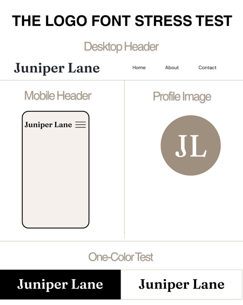
Do not approve a logo font while looking at one large, perfect version on your computer screen.
Test the logo in the places it will actually appear:
- At the top of a website on desktop and mobile
- Inside a small social profile image
- On an invoice, proposal, or contract
- As a watermark on a photo
- In black on a white background
- In white on a dark background
- At a very small size
- In a horizontal and stacked logo layout
If the font only works when the logo is enormous, it does not work.
Create a simple one-color version before approving the full logo. Color can make a weak design feel more exciting than it is. When the logo works in solid black, you know the typography and structure can stand on their own.
Then check the font license before delivering anything.
“Free” does not mean “license-free.” Google Fonts explains that every font still has a license, even when it is available at no cost. Open the license information for the specific font and confirm that your intended commercial use is permitted.
Paid marketplaces and subscription libraries have their own rules. Adobe Fonts currently permits commercial logo use and trademark registration, although the typeface design itself cannot be claimed as the trademark. Creative Market currently permits logo use under its Desktop License, but its guidance places a separate restriction on using the licensed font as part of a trademark.
Those terms are different enough to matter. Check the current license from the source instead of assuming every commercial license works the same way.
If you are designing for a client, keep the receipt and license details with the project files. Tell the client whether they need to purchase their own license to install and use the font. Sending them the font file without permission is not a cute little bonus. It can violate the license.
This is general design guidance, not legal advice. When trademark rights or unusual commercial uses are involved, review the exact license or have the client get legal guidance.
Logo Font Mistakes to Avoid
Choosing a font because everyone else uses it
Popularity can make a font feel safe, but it can also make the brand look like every Canva template in the search results.
Using a script for a long business name
Some scripts work beautifully for one short word. Stretching them across four words can turn the logo into a handwriting test.
Ignoring spacing
The default spacing is not always the best spacing. Adjust kerning carefully so letters feel balanced without creating strange gaps or accidental new shapes.
Making every word equally important
The business name, descriptor, and tagline should not all compete at the same size and weight. Decide what someone needs to notice first.
Forgetting the client’s daily tools
If the client needs to recreate graphics in Canva, verify that the supporting brand fonts are available there or can be uploaded under the license. The logo can be supplied as a finished file, but the rest of the brand system still needs to be usable.
Picking website fonts without checking performance
A font that works in a static logo may not be the best choice for live website text. Confirm that a proper webfont license is available and avoid using elaborate display fonts for paragraphs.
A Quick Logo Font Checklist
Before approving the final choice, ask:
- Does the font match the brand’s personality and audience?
- Can I read the business name immediately?
- Does it work at small sizes?
- Does the pairing have clear contrast and hierarchy?
- Does it work in one color?
- Is the license appropriate for logo, commercial, web, and client use?
- Can the client use the supporting fonts in their everyday tools?
- Will this still make sense when the current trend moves on?
If you cannot answer yes to most of those questions, keep testing. Falling in love with the font is optional. Making sure it can do the job is not.
Strong Logo Fonts Do More Than Look Pretty
The best logo fonts feel right for the brand and work in real life.
Start with personality and audience. Protect readability. Use contrast with intention. Keep the number of fonts under control. Test every practical use and confirm the license before delivery.
That process may not feel as exciting as grabbing the first pretty script in Canva, but it produces a logo the business can actually keep.
Build a Stronger VA Business
Inside Virtual Pro Society, Virtual Assistants get practical resources, weekly content support, and straightforward guidance for building a business that works. No giant font party required.
Helping VAs ditch the BS and build systems that actually work.

